Skip to content
UX Design & Visual Design

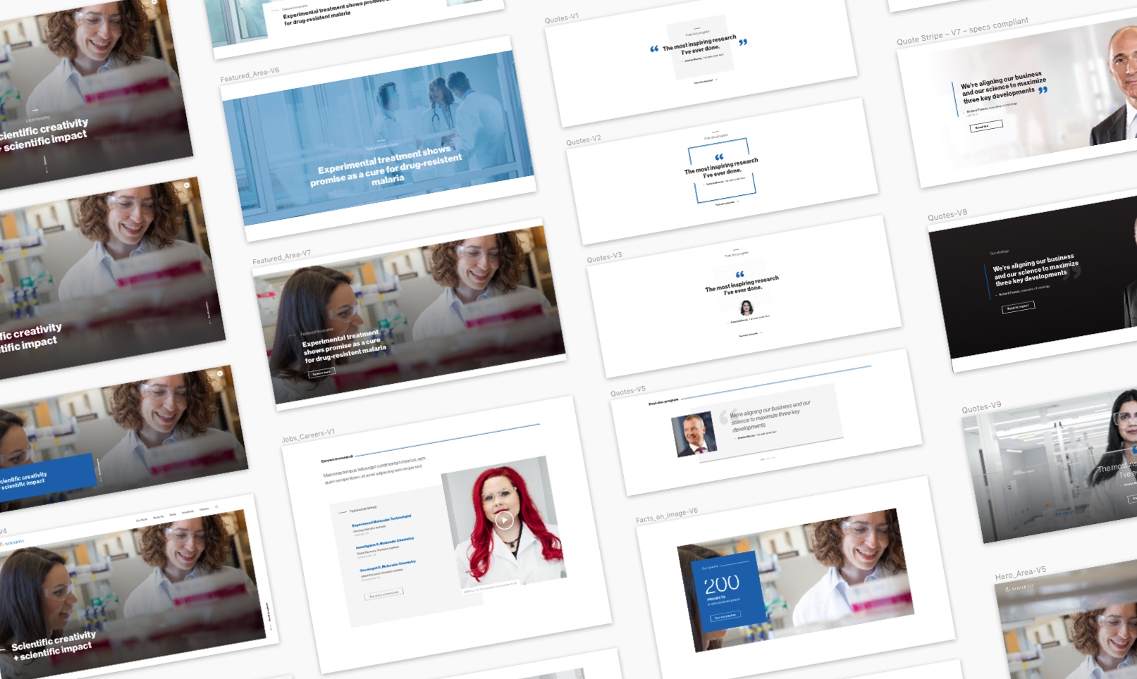
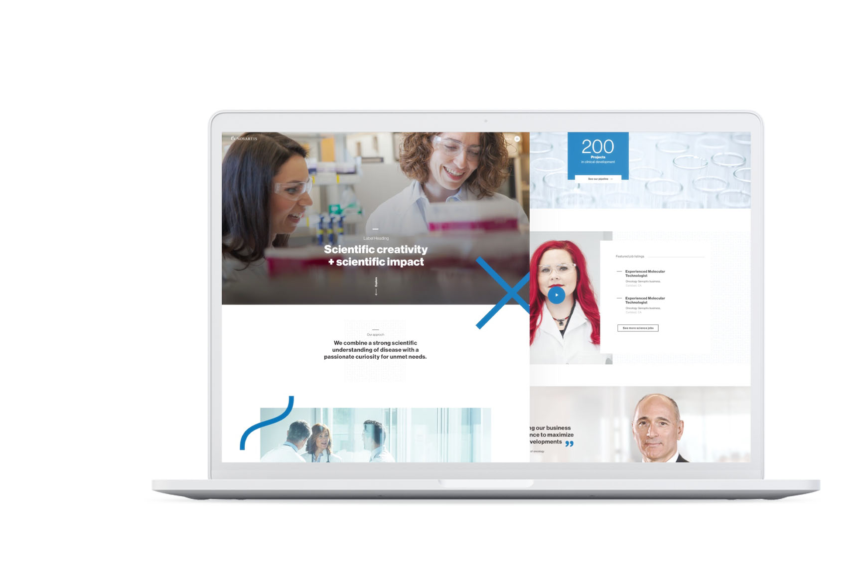
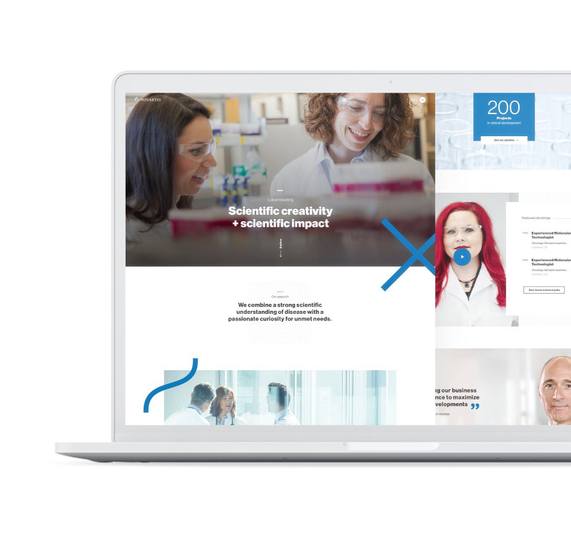
Novartis — Bringing a New Visual Identity to Life

In a nutshell

We were mandated to apply the new branding and to redesign a series of platforms and digital channels. The new visual identity was introduced by the principles of Swiss Style, also known as International Typographic Style. Swiss Style is designed to achieve clarity, order, and a universally understood visual language.

Novartis Business Challenge

Ensuring that all of the major site audiences reach the info they are looking for, and have a branded impression of the site and company; engaging current and potential employees with high-quality science content.

Project overiew

Duration

06/2019 — 04/2020

Team setup

cross-functional team of 1 project consultant, 1 interaction designer, 1 frontend developer and a product owner

Technologies

Drupal 8, OneWeb, Dolphin

Services

conception & design consulting, interaction design, digital branding, UI design & testing, human centred design, frontend development, information architecture, design systems

About Novartis

As a leading global pharmaceutical company, Novartis uses scientific innovation and digital technologies to develop breakthrough therapies in areas of great medical need. Based in Basel, Switzerland, Novartis provides solutions to address the evolving needs of patients worldwide.

Challenges & objectives

Working for a giant like Novartis, we had to ensure that all our solution were aligned with their guidelines and were following their rules. They needed a strategic partner specilized in design systems and they noticed that the program “Dolphin” was not enough. Ultimately, they needed us as a design partner for novartis.com

Our solution

To create the best possible digital experiences across platforms, we decided to work with a methodology called “atomic design”. It’s like chemistry, where everything is composed of molecules made up of atoms. And just as in chemistry, web applications are first broken down into their smallest building blocks and then combined and assembled into more complex design units. The name “atomic design”, therefore, is not created arbitrarily but reflects precisely this principle.

Following the atomic design process it was not about disassembling full designs into their parts. It was more about constructing full design experiences building up from the smallest design elements we created during the process. By doing so, we built a consistent and extendable digital experience. The result may look the same, but the approach has significant benefits.

End results

Bringing design to life: Micro-interactions and little animations have one purpose, which is to delight the user. It’s all about creating a moment that is engaging, welcoming and, dare we say – human. During our design process, we made many motion studies envisioning the final user experience.