Skip to content
UX/UI Design

Medaia — SkinScreener App Reenvisioned 

In a nutshell

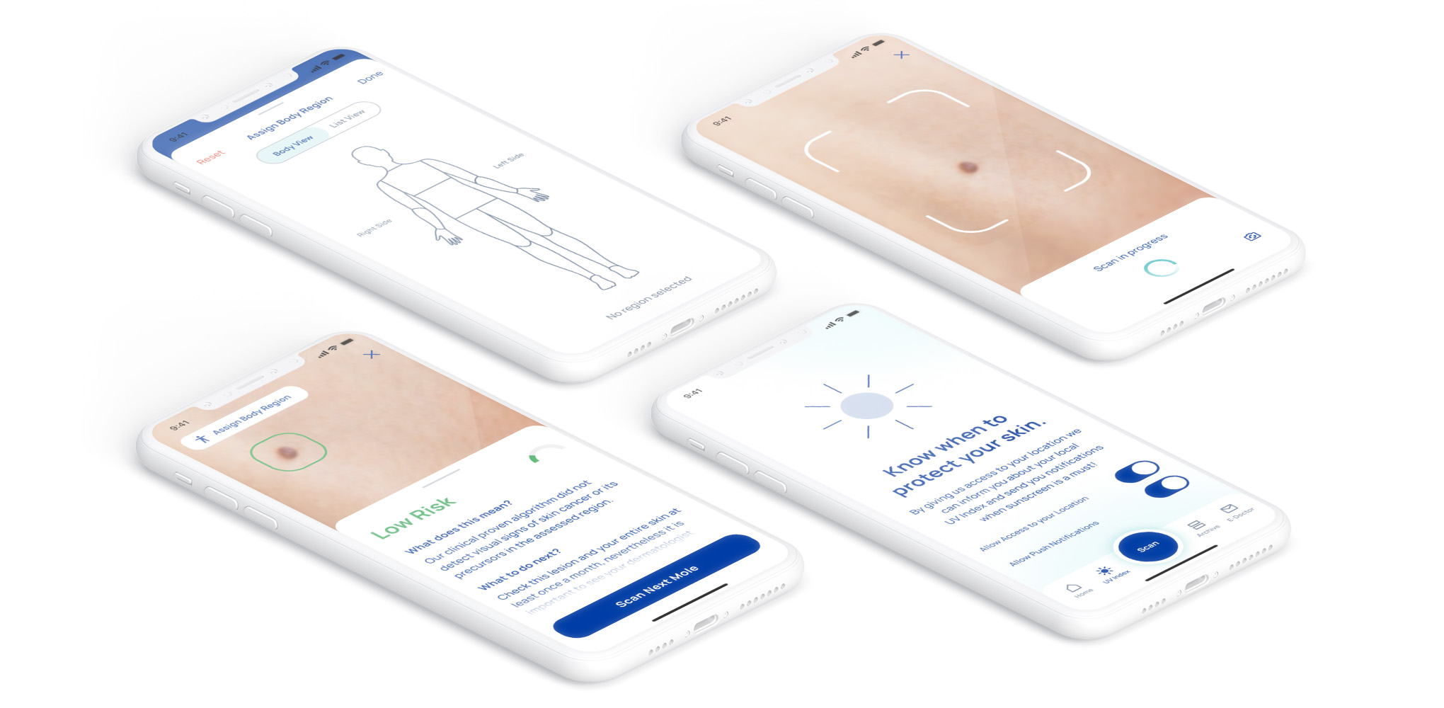
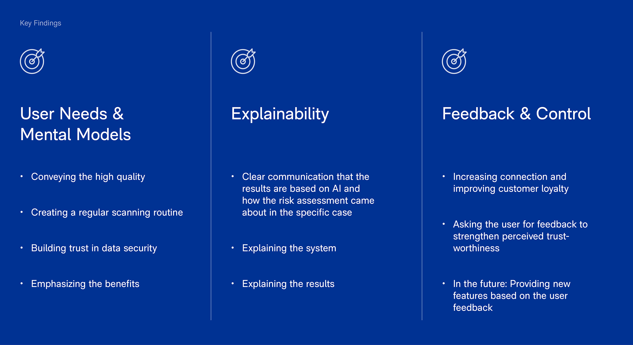
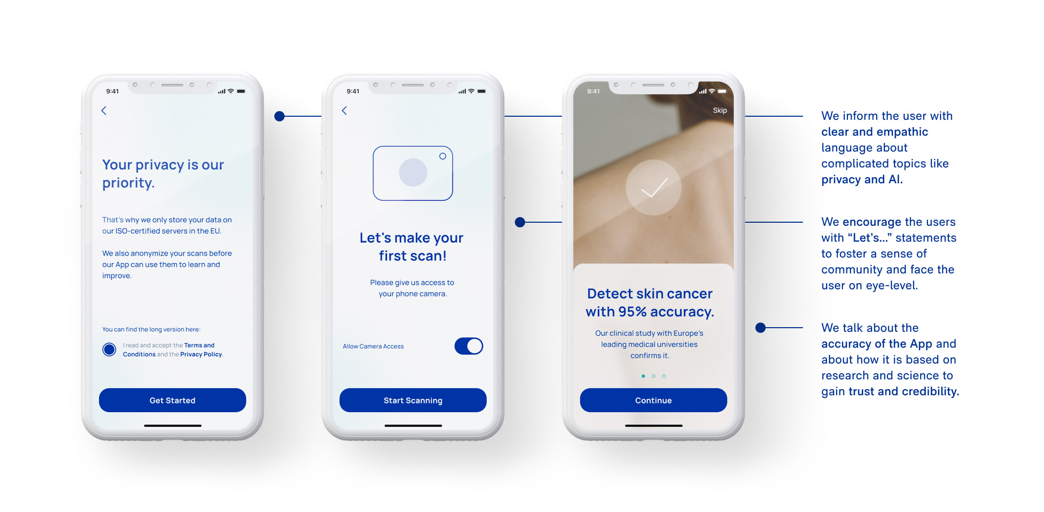
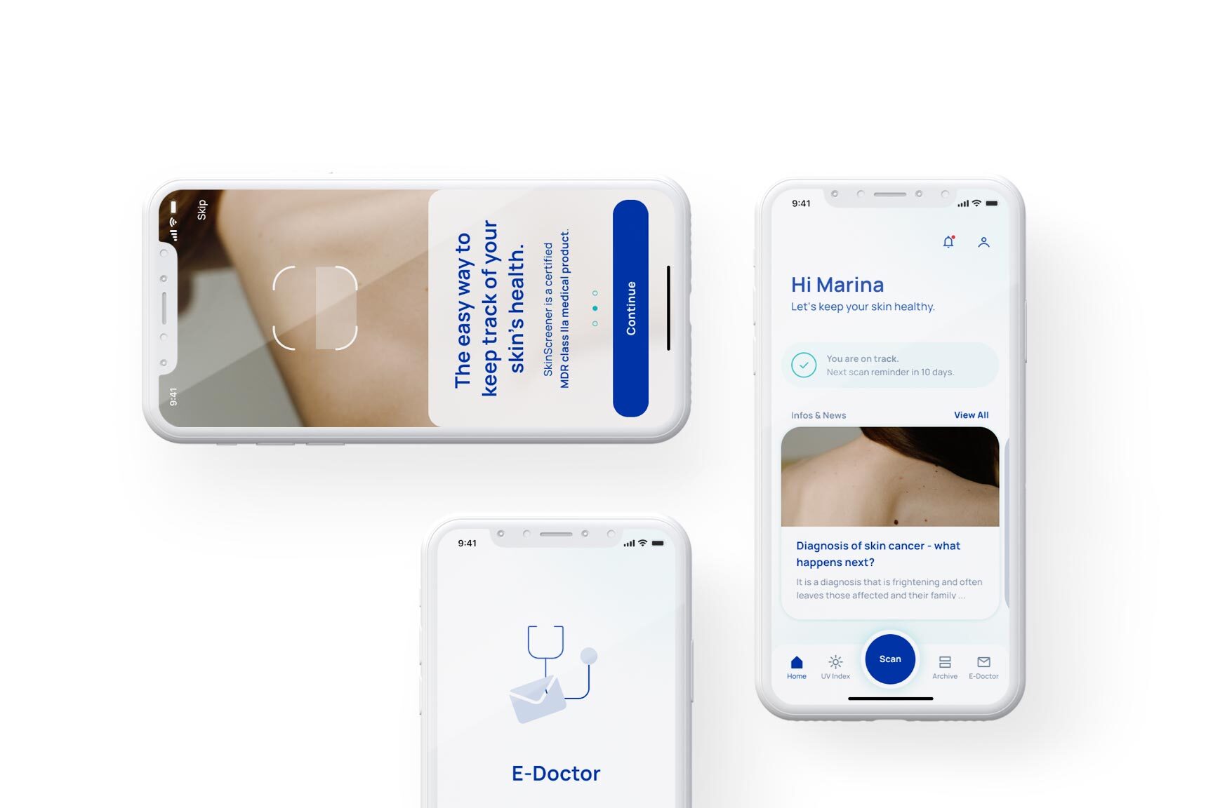
SkinScreener is a certified medical app for a quick and easy skin cancer risk assessment. By using AI, the app scans and analyzes skin spots (moles, skin lesions or similar) with an accuracy of 95%. Parkside Interactive redesigned the UX and UI of the app in close collaboration with the client. To communicate the importance and trustworthiness of the app, the redesign put special focus on explainability, control & feedback, and building trust in AI.

medaia
Business Challenge

Bring across the quality of the risk assessment and gain user trust. Raise awareness about the benefits of the app and motivate the user to establish a regular routine of using it.

Project overview

Duration

12/2021 — 03/2022

Team setup

Principal UX designer with a focus on user research and UX for AI, Lead UX writer, UX designer, UI designer

Services

Design consulting, user research, UX writing, UX design, UI design

About medaia / SkinScreener

medaia GmbH is an innovative start-up based in the heart of Styria, Austria, run by experts with different specializations, ranging from neuroscience to medicine and biomedical engineering. It focuses on developing easy-to-use, clinically validated digital products based on AI.

Challenges & objectives

After the first versions of the app focused mainly on optimizing the AI technology and its accuracy in detecting and classifying skin spots, our task was to help bring the app’s user experience to the same level. The app redesign had 3 major goals:

01

Building up the users’ trust

A patient-doctor relationship involves a certain amount of trust — not just in the doctor’ skills and abilities but also in the confidentiality of patient’s data and status. Our goal was, therefore, to bring across the benefits of using the SkinScreener app and build a corresponding level of user trust in it.
02

Explaining the system & the result

The way artificial intelligence works is beyond the comprehension of many people, and its results are often difficult to understand because they are based on complex analyses and calculations. Our goal was to explain to the user what the app’s individual risk assessments are based on and why it delivers such accurate results.
03

Enhancing the interaction

Communication and feedback are basic components of human interactions, and so is the case when you visit a doctor. The app’s feature to provide feedback is intended to mimic a good doctor-patient relationship and thus increase users’ trust and the likelihood of using the app regularly.

Our solution

In a series of workshops with our client, we gained an in-depth understanding of their users and learned how to reduce their skepticism towards artificial intelligence. We mapped the user needs, expectations, and mental models to find the correlation with traditional skin exams. Additional UX writing sessions helped us research and define the use of language in a medical context. The results served as the basis for a refined user experience concept in line with user expectations as well as a more appealing visual design.

What we implemented

01

Welcome screens & user onboarding

To build users’ trust we implemented onboarding screens which explain how the app works, the science behind it and why it’s so accurate. We also go into detail about data privacy, data storage and other security related questions.
02

Explanation of medical practices & e-Doctor

To help the user understand how the app assesses their scans, we explain medical practices and the science behind the app in a simple and understandable way. In the new app version the users have an additional option to request an assessment from an e-Doctor.
03

Scan reminder & body map

In order to help them build a regular routine of using the app, users can set up reminders for their upcoming scans and use a body map to assign their scanned skin spots to a body region and thus keep track of them more easily.
04

New visual design & modern look

In communicating the quality and trustworthiness of the app, the visual design plays an essential role. For this reason, colors, fonts, and shapes were redefined and precisely coordinated to give the app a professional and modern look.
05

Improved UX writing & caring voice and tone

We defined UX writing guidelines and created a caring, enthusiastic and professional voice & tone for the app. A caring voice anticipates users’ concerns and needs and seeks to raise their awareness of skin cancer.
06

The possibility to give feedback

To show that their opinion matters and to improve the overall service of the app, we also gave the users the possibility to give feedback.

End results & future plans

With the new app structure, a strong focus on UX writing, and the new visual design, we were able to create more transparency and increase users’ trust. New features, like the reminder and feedback function, ​​make the app more easy and convenient to use . The app’s new UI design emphasizes the product’s quality and visually contributes to a positive user experience. After we handed over the final UI screens and the UX writing guidelines, the app is now being developed by the client.

In the future, additional features could lead to an even more enhanced user experience. For instance, users with high-risk ratings who get an opinion from a dermatologist could share their feedback within the app as to whether the rating was correct or incorrect. In that way, AI could learn even more from users’ feedback and increase the accuracy of its assessments.